
This personal portfolio exists to give visitors, whether prospective clients or recruiters, a clear picture of what I do, the skills I bring, and the detailed work behind every project I have built. It now runs in both English and Indonesian, so the same case studies read naturally for local clients and international visitors alike.
A scrollable look at the finished site, exactly as a visitor would browse it.
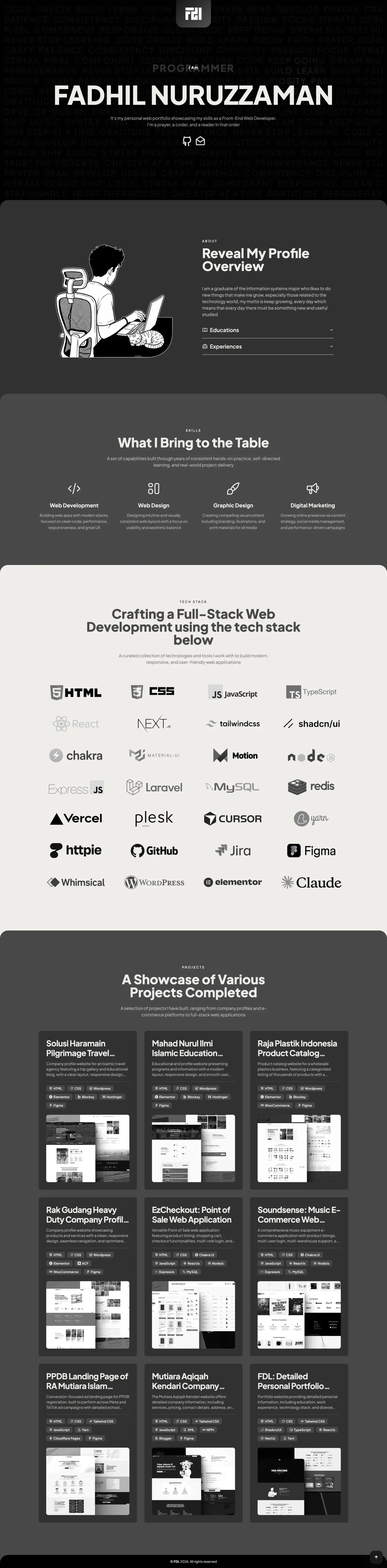
Desktop

Mobile
Work like this is usually split between a developer, a UI/UX designer, a graphic designer, and a marketer. On this project, one person holds all four of those skill sets, so every decision came from someone who understood the whole project, not just their own part of it.
16
standards met, from code to marketing.
Business impact here is measured across 5 areas: Presence, Quality, Trust, Conversion and Growth. Together they cover how the business is found, perceived, and acted on.
One detailed destination, not scattered evidence
Before
There was no single place presenting a full, detailed picture of my skills and work process to visitors, just scattered evidence across different channels.
After
This portfolio now serves as one detailed, comprehensive destination that clients and recruiters can review directly, without piecing anything together themselves.
Each project draws on a mix of disciplines: here’s how they came together on this one.
The tools and technologies that came together to bring this project to life.










The problems that came up while building this project, and what came out of solving them.
Animation Consistency Across Sections
Each section originally had inconsistent animation delays, standardized into a single delay hierarchy: label, then title, then description, then content.
Framer Motion Hover Conflicts
Combining entrance animations with hover-lift effects on the same element silently broke the hover, since Framer Motion’s inline transform style always wins over a Tailwind hover class, solved by splitting entrance and hover effects across an outer and inner element.
Transparent iOS Status Bar
Content briefly bled into the status bar area on iOS 26, resolved with a full-width navbar that covers the top strip of the viewport on scroll.
PWA Launch Flicker on iOS
iOS briefly shows its own launch placeholder before the first paint, which can’t be touched by app code, so the fix was accepting one clean flash instead of layering workarounds that made it worse.
Keeping Two Languages in Sync
Every case study exists twice, so any edit risks the two versions drifting apart. The content was split into a shared file for facts and one file per language for prose, then checked with scripts that verify both languages carry the same structure before anything ships.
Navbar State Rebuilt on Every Navigation
The navbar decided whether to show its full-width bar from state that was rebuilt after each page transition, so it could render in the wrong mode for a moment before correcting itself. Tracing it led to how the router remounts components on navigation, and the fix was to read scroll position at render time from a store that outlives any single page.
The technical problems fixed while building this project.
Vulnerability patched
Correct from the first frame, every navigation
Images under 200KB
Faster image pipeline
Verified in sync, every deploy
Clean status bar
Before
The site ran on an older Next.js version with a disclosed security vulnerability.
After
Upgraded to a patched version with no visible change to the site’s behavior.
Before
The navbar decided whether to show its full-width bar from state that was rebuilt after each page transition, so it could render in the wrong mode for a moment before correcting itself, a bug that kept resurfacing across multiple attempted fixes.
After
Scroll position is now read at render time from a store that outlives any single page, so the navbar renders correctly from the very first frame regardless of how the router remounts components.
Before
High-resolution images across the site, not just one section, risked slowing down every page.
After
Every image across the site is compressed to WebP and kept under 200KB, keeping pages fast without a visible drop in quality.
Before
Without sharp installed, Next.js falls back to a slower WASM image processor in production.
After
Installing sharp speeds up image optimization and delivery on every page.
Before
With every case study existing twice, any edit risked the two language versions drifting out of sync with each other over time.
After
Content is split into a shared file for facts that never change and one file per language for prose, checked with scripts that verify both languages carry the same structure before anything ships.
Before
On iOS 26, page content briefly bled into the translucent status bar area.
After
A full-width, scroll-aware navbar keeps the status bar area clean.
